
Adjusting My Website for Book Sales (SPF Journal)
As mentioned in my last post, I’m working my way through Mark Dawson’s Self Publishing Formula in an attempt to boost my online Kindle sales. Two days in and I’m barely scratching the surface of this course.

In the first module, Mark talks about using your website as your hub for your community; that is, the place where people can find out more about you and your books. “Interaction with readers is a fundamental strategy,” Mark says. “It’s really important to generate that contact and that connection.” He went on to talk a bit about social media, too. Before messing around with tweaking Amazon, he suggests looking at your website and laying some groundwork on your social channels.
Fortunately, my focused social sites are in pretty good condition. And since I already have a website, I only needed to update it.
After looking at Mark’s examples of his own website and those of his colleagues, I realized I’d allowed my website to become like my LinkedIn profile—a dump of my book listings, testimonials and projects. Instead, he recommended that each page have intentional focus to push people to your books on Amazon (or wherever).
With that in mind, I’ve spent the last couple days laying down some improvements. I still have more I want to do (does the tweaking ever stop?), but for now, this will allow me to move on.
Ch-ch-ch-changes
The first page I focused on was my main “Books” page. Here are the before and after pictures:
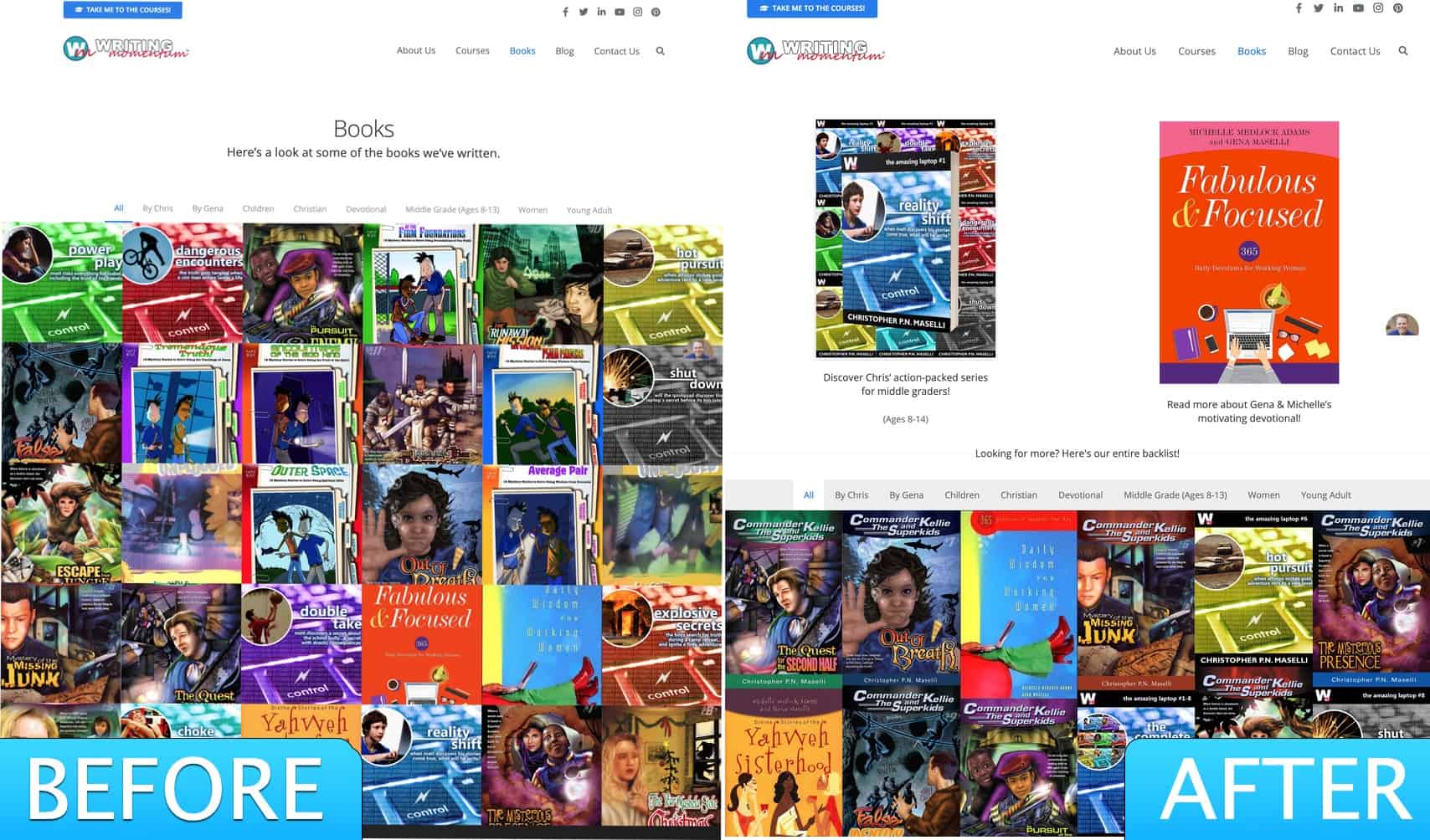
“Before,” the page threw interested readers right into our entire catalog, with no place to rest their eyes. And the books were thumbnail representations of the whole covers.
“After,” I’ve dropped our backlist down to the bottom of the page, and made the books full-cover shots. Now when readers arrive, they’re faced with the two main books they’ll likely be interested in: My Amazing Laptop series for children and my wife’s devotional with Michelle Medlock Adams. That’s it. Focus, man!
(By the way, I also created a singular landing page for my Laptop series, now allowing readers to see the entire series rather than just an individual book at once. They can still do that, but now the series page leads to the individual book pages.)
The next big change takes place on the individual book pages:

“Before,” the page assaulted you with a gigantic image of the book and copy, copy everywhere.
The changes I made include making the book shot smaller, dropping the “Author Secrets” section and adding a lot of white space. The page can breathe! I added subtle color bands that allow your eyes to settle and I removed the book carousel. In its place, I added a list of only the novels that are part of this series. Then, at the bottom is social proof.
So much better!
There are still things on my list of wants. I want to add my Lead Magnet to the home page, create a second Lead Magnet of Short Stories, create non-distracting true Lead Magnet landing pages and more. But this is a good start.
It’s been a good 48 hours of Self-Publishing Formula action.

Frustrated?!?
You're not alone, friend! Click here to download our FREE PDF: The Top 10 Ways to Get Noticed by Agents, Editors and Readers. YOU'VE GOT THIS!